Lead with the rate.
Empty states and very small projections use static APY messaging, rather than celebrating an underwhelming dollar amount.
“Start earning interest with your first deposit!”
 Katie JamesProduct & experience design
SELECTED WORK / 02 · DEPOSIT EXPERIENCE
Bank linking was the biggest drop-off point in Wealthfront’s Cash Account signup. I moved the deposit amount step ahead of it, so customers could see what their money could earn before being asked to connect their bank.
See the change in the journey ↓Increase in initial deposit amounts
The unexpected behavioral resultPRIMARY GOAL / CONVERSION
New accounts opened increased 3.7%, but the lift was not statistically significant.
The experiment did not establish the conversion improvement we hoped for.UX strategy & execution · End-to-end product design
Data science · Engineering · Product · Legal & compliance
01 / THE FRICTION
80.6%
of Cash Account prospects didn’t fund their accounts. Across the signup journey, the highest drop-off occurred at bank linking.
Investing customers saw a personalized portfolio before connecting a bank. Cash customers went almost straight from contact details to bank linking—with little opportunity to understand why moving their money was worthwhile.
02 / THE PRODUCT DECISION
I moved the deposit amount step before bank linking. That gave us a place to demonstrate potential earnings before customers reached the point where most were leaving.
03 / MAKING THE VALUE UNDERSTANDABLE
The first proposal highlighted a static 2.00% APY. I was concerned it still asked customers to calculate the benefit themselves: what does 2% mean for my deposit?
“Clients don’t feel confident understanding APY in general and feel concerned they’re missing out on additional savings opportunities.”
Finding shared by the Banking team · Survey and interviews from a separate project
That insight sharpened my direction: show the impact of the rate as a dollar amount. I worked with data science to confirm we could project interest, then designed the flow, content and animated earnings display around that tangible benefit.
04 / THE EXPERIENCE
I designed the experience to respond to the customer’s deposit, translating the rate into potential annual earnings and adapting the message to the amount.
Recreated from original designs. Illustrative historical 2% APY; not a current offer.
Portfolio demonstration using the historical 2% APY shown in the original design. Illustrative annual earnings equal the entered deposit × 2%, assuming that rate and balance remain unchanged. This prototype does not open or fund an account.
AFTER · PERSONALIZED EARNINGS
A CONTENT SYSTEM, NOT A SINGLE LINE
I developed a range-based content matrix to make the response relevant at different deposit amounts—and give engineering clear requirements and edge cases.
Empty states and very small projections use static APY messaging, rather than celebrating an underwhelming dollar amount.
“Start earning interest with your first deposit!”
Encourage progress without suggesting a small deposit is inadequate.
“Every bit adds up.”
Turn the projected amount into an understandable, tangible upside.
“Hey, free money!”
Connect larger projected earnings to a sense of financial progress.
“Say hello to passive income!”
Historical 2% APY examples. The demo uses deposit × 2% for an illustrative year with an unchanged rate and balance.
MOTIVATION WITH CARE
I made the next action explicit—“To earn even more interest, you can increase your deposit amount”—without commanding a larger deposit. Legal and compliance review helped refine the projection language and disclosures for a rate that could change.
We used existing research, design critique and legal review to prepare this A/B test. We did not run a new round of user testing.
05 / WHAT THE EXPERIMENT SHOWED
Initial deposit amounts increased 20%. The change in new accounts opened was +3.7%, but not statistically significant—so we did not establish the improvement in conversion we intended.
The deposit increase was worth exploring further. It suggested that showing a concrete benefit could influence how much people funded, even though the conversion result remained inconclusive.
06 / CARRYING THE LEARNING FORWARD
I worked with our marketing copywriters to bring that same approach to the pricing page: translate an abstract percentage into a tangible dollar amount, then give it an everyday point of reference.
As visitors adjusted their investment amount, the page showed the corresponding monthly cost and dynamic copy that put it in perspective. The principle carried forward: help people understand what a financial number means for them.
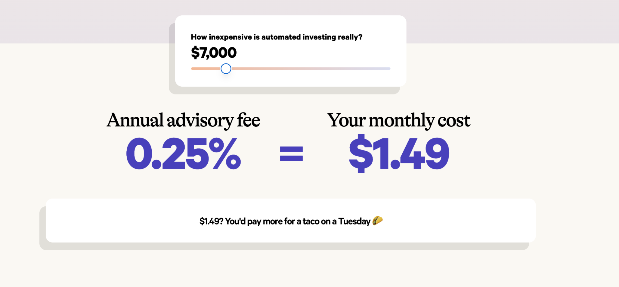
Original pricing-page example · Dynamic amounts and everyday comparisons made pricing tangible.
WHAT I CARRIED FORWARD
Make the benefit concrete. Share the insight. Give the next team a stronger starting point.
CONTENT EXPLORATIONS
I explored ways to express the same benefit through growth, progress and passive income. The language needed to make projected interest feel immediate and understandable at the point of deposit.
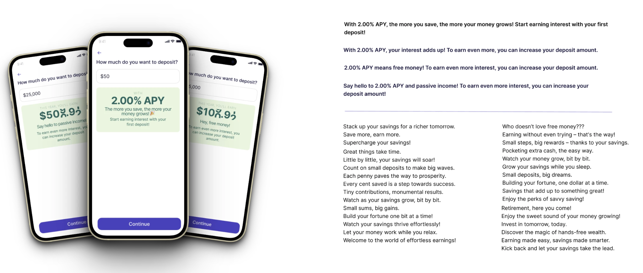
Original content explorations · Select to view at full size